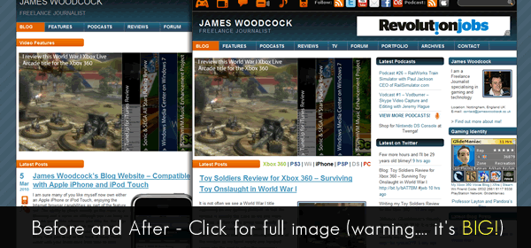
Recently I was talking to my friend, and fellow blogger James Woodcock, about his website and somehow I ended up suggesting I spend an hour or so tidying it up.
James is a video game and tech journalist… and an endless tinkerer. He loves messing around with his website – adding new content and improving the functionality. Unfortunately lots of additions has meant things got a little confused and somewhere along the way things became a little untidy and Tammie Listers original design got lost.
Goals
My goal was not to redesign the site but to refresh it. I wanted to improve readability and simplify where possible without getting lost in a full-blown re-imagining.
Below is an overview of what I changed and why.
Whitespace
Add line-height to paragraphs and titles. All of the lines of text were squashed together turning the text into a block of words and not lines. Larger line-heights (more space between lines) increases legibility by breaking up these blocks which in turn stop makes it easier to read a line and will help guide the eye back to the beginning of the next line.
Increase margin around images. There was some spacing around the images but increasing that value stops the text from running into the images, which breaks the reader’s attention and makes it harder to realise when you get to the end of the line.
Increase spacing between and around posts. This makes it clearer what elements belong to what posts. In the original design the headings and meta data all blended in together – and spreading them out makes the site easier to read at a glance.
Space out columns in the footer. All of the footer content was squashed right up both horizontally and vertically. Like the line-height comment above, adding extra spacing between columns, and more padding between items, makes it easier to separate elements.
Increase letter spacing on anything with “text-transform:uppercase;”. I am growing to really like the css property “text-transform:uppercase;”, it can add a bit of visual interest to text on a site, but by default the text is bunched up really closely. Simply adding a letter spacing of 1px makes a huge amount of difference to both legibility and aesthetics.
Structure and Design
Line things up a bit better to create a more structured grid. I didn’t bother creating a proper grid for the site, but in the original version there were lots of elements that should have been in the same column that did not line up. Altering the margins added an element of consistency and made the site a lot easier to scan.
Remove unnecessary data. This was an area we discussed whilst I was making the changes, but in the end we decided that reducing the clutter would be a good thing. So we removed the category icons, and the dates. This did a few different things. It allowed me to straighten up the spacing on the homepage so that it was consistent with the internal pages and it simplified the layout of the posts reducing visual distraction. The area we discussed the most was the post dates. Originally I repositioned them so that they were a line of text above the post titles, but in the end we decided removing it was the best thing to do as it decluttered things and wasn’t essential to the use of the website – additionally the dates were available on the individual post pages so hadn’t been removed entirely.
Tweak Colours of header text. This one was a little contentious. I actually made the text pure white originally and James was concerned that it was too bright. He didn’t want so much focus on the header – but I argued that since he was the brand he should make it clear where people are and what they’re reading – we came to an agreement about the colours quite quickly and ended up with a very light grey.
Left align sidebar text. For me this was a no-brainer. Right aligned text is simply not readable for large chunks of text. For native English speakers (and readers) a jagged left edge is hard to scan as there’s nothing to anchor the eye. It was a small change for a large win.
Conclusion
The changes to the site were individually all very minor, and the brand was kept mostly as it was, but in the longer term I think it will make a big change to the use of the site. Thankfully James was (really) pleased with the results as well and he gave me the wonderful quote below about my work on the site:
After a few months of tweaking my website with my basic CSS skills, I asked Ben if he would spare just an hour to have a look at the style settings and see if there were any alterations he could implement that would improve the look and feel.
Ben not only managed this, but smashed my expectations by transforming the website with a far cleaner experience and even older posts with little information look shockingly good compared to before.
Ben has not only improved my website for all of my visitors, but has also inspired me to work that bit harder when creating new content and add new features to add to his work.
Let me know what you think on Mastodon, or BlueSky (or Twitter X if you must).
Link to this page
Thanks for reading. I'd really appreciate it if you'd link to this page if you mention it in your newsletter or on your blog.
