In January I published Colour, a simple app that analyses the colours used in a website and suggests ways you can merge the colour to make the design simpler.
I don’t know if it’s an age thing, or a generational thing, or if I’m just late to the game, but in recent years I have learnt to appreciate simplicity. I like things that are simple. Not just simple to use but simple in design – and consistency is a big part of this.
I’ve been running Pro Theme Design for a little over 10 years now, and I feel like only now am I finding my design voice. A style that is mine, that I can work with consistently. But that means that older themes don’t have those design traits. In particular the ones I made where I collaborated with others.
One of the things I enjoy doing is going back to the older themes and simplifying their designs. Improving consistency. Things like making sure margins and padding are consistent. Or colour choices are minimised. Or fonts styles used are just the ones needed. To be honest many of these changes are small tweaks that most people won’t notice. But put together they make the theme feel more harmonious. Having consistent colours, spacing and fonts helps the design hold together better and feel more professional.
These days with preprocessors it’s a lot easier to minimise colour usage (just use the ones in your styleguide/ library) but in the good old days of handcrafted css it was a lot easier to just make up a colour on the spot. And that’s the problem I had.
Whilst trying to work out a simpler way to solve this I found a website called Colorfy that lists all the colours used in a site. This helped me to see what colours were involved, but I wanted to reduce the colours used so I then had to go through and work out which ones to replace/ merge. Then I spotted that Colorfy has an API.
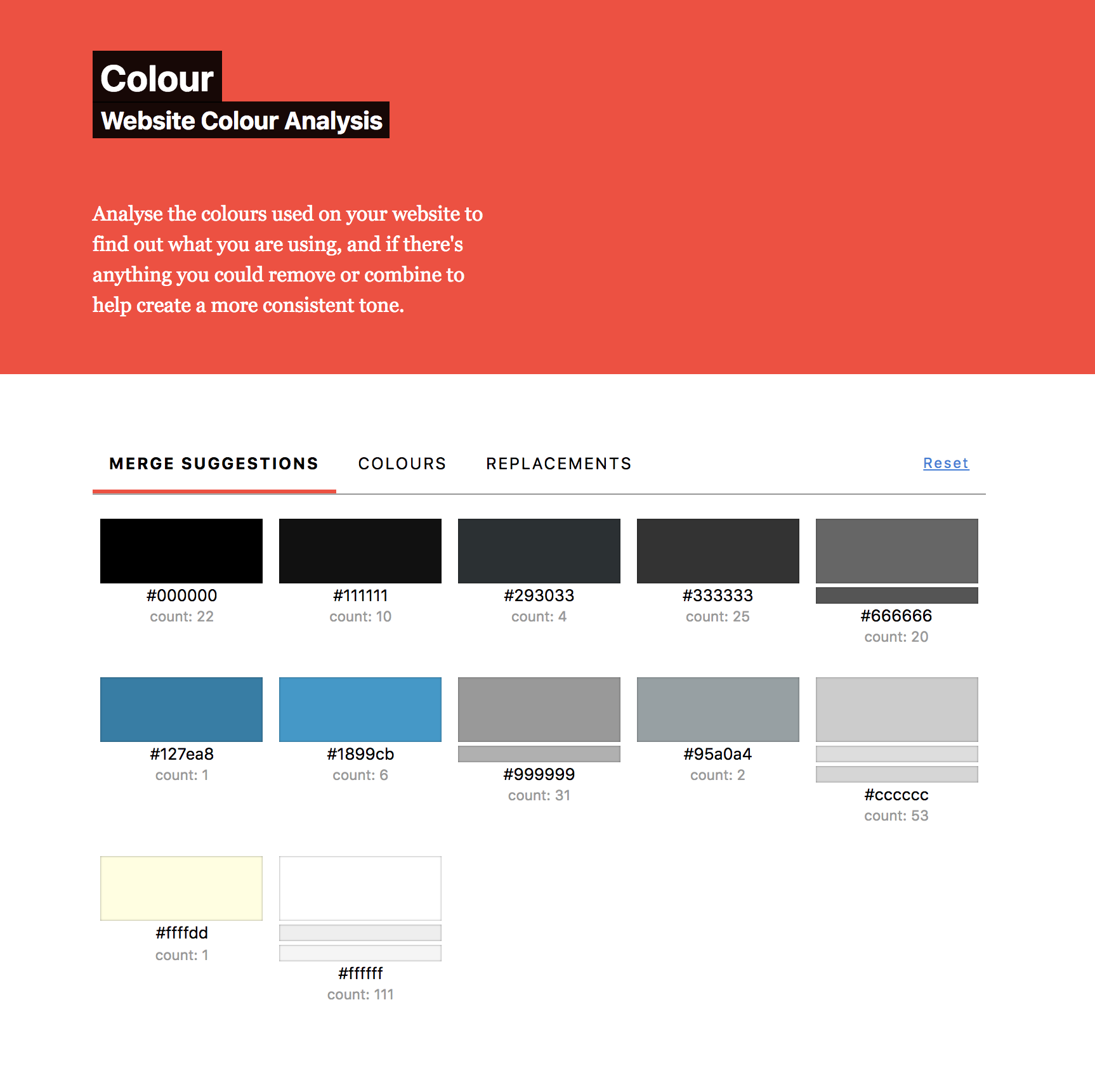
So I made Colour, a single page web app for Pro Theme Design that analyses the colours used in a website and suggests colour combinations to merge to simplify the design.
Making it
The initial build was quite simple. I considered using this as an opportunity to learn React/ Vue but instead decided to stick to what I know. I didn’t want this to be a long project so I used FlightPHP as my PHP framework, and jQuery for all the javascript bits.
For the CSS I used Tachyons and this was new to me. I had read about it a few times and conceptually liked the sound of it. Having now used it however, I don’t think I’ll use it again. There were things I liked, in particular with regards consistency, but in general it felt a bit too convoluted. I didn’t like having all the css classes littering my html, and I found it hard to get started with. The documentation is thorough but not entirely logical, at least not until you learn the logic of Tachyons.
Colour usage tips
For me the most useful part of Colour is the replacements tab. This gives you a pipe separated list of colours to find, and the colour to replace them with. This is useful because you can turn on regex find and replace in your IDE and then use the piped content to find all instances of the colour and replace them. It’s not perfect, for example it only finds #eeeeee and not #eee, but this can speed up the process considerably.

How was it for you? Let me know on BlueSky or Mastodon
(Please) Link to this page
Thanks for reading. I'd really appreciate it if you'd link to this page if you mention it in your newsletter or on your blog.