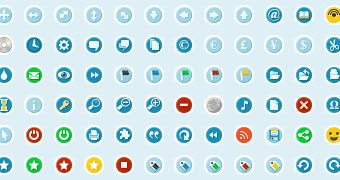
Last week I released a new icon set over on Pro Theme Design. When I first started on the set I had two objectives. 1 – to spend some time learning how to make icons properly, and 2 – to make a set that I could reuse in future projects.

As time went on the set evolved and Circular was the result.
What went right
The overall outcome was quite nice. I made a complete set of over 100 icons, including a few that I use on Pro Theme Design itself.
- When I started the icons I wanted them to have a consistent look and feel, so I created a small palette of swatches that I sampled colours from.
- I learnt a lot about icon design. Ok, not an interesting point, but still worth pointing out. The way I learn is by researching, then doing. Reading about things is fine but if you don’t put them into practice you (I) will never improve.
- Fireworks worked great for developing the icons (apart from a couple of points mentioned below). I was able to make use of the symbols to reuse common elements, and then tweak them when required. I was also able to make use of Fireworks scripting abilities to automate some of the tasks.
What went wrong!
- The circles. Trying to keep things consistent I decided to put circular backgrounds behind the icons. The idea being that the colour denotes the icons properties (green = good, red = bad, yellow = service etc). Unfortunately the colour scheme got lost, and the circles meant the rest of the icon had to be a lot smaller.
- Not using symbols. I used Fireworks for the design and think it worked out very well, however Fireworks has a symbols system which means I could have created reusable elements (the circle backgrounds for example) and using these would have made updating the icons a lot easier. As an aside, Fireworks also became rather slow whilst developing the set. This may be because I had 100+ icons in a single Fireworks png. However the next time I try something like this I will be giving Inkscape a go.
- Publicity – this is something I really suck at. If anyone wants to give me any hints and tips then please let me know! 🙂 One thing I did manage was getting onto Smashing Magazine, but otherwise it was pretty lightweight.
I don’t think I really achieved either of my two objectives. Yes; I now know more about icon design, but I’m a long way from competent. Reusing the icons is something I will likely do, but I am not entirely happy with them, so will be making at least one more set in the future.
How was it for you? Let me know on BlueSky or Mastodon
(Please) Link to this page
Thanks for reading. I'd really appreciate it if you'd link to this page if you mention it in your newsletter or on your blog.