I mentioned in my first post that I was going to do a run down of how I redesigned this site. It’s taken a while to put together but here it is.
Binary Moon – a brief history
I started Binary Moon in the year 2000 as a place to show off the video games I had made (they will return soon). The site started off as being contained entirely in a small popup window which contained frames. Not good for search engines but my games were reasonable so I got quite a few hits. A couple of years later I relaunched with a site that used a php content management system written by myself. Better looking but still overloaded with tables and spacer gifs – still not ideal.
The relaunch was helped considerably due to the fact that I released a game called Limit Rush which was accompanied by a tutorial I had written explaining how to make the game.
After Limit Rush not a lot happened with Binary Moon. Rocket Boards, my first ‘for sale’ game was written and released, and was sold through the site, but a personal site isn’t the best place to advertise something so Binary Sun was born. Binary Moon was then left to rot.
A year after the release of Binary Sun I managed to get a job at a very cool online gaming company called Miniclip which meant I didn’t have to do the freelance design or odd jobs I had been doing. So, with more than a little persuasion from one of my friends at work, I decided to turn Binary Moon into a blog – time for a major redesign.
The blog design
Version 1 – no way
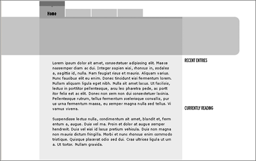
I wanted to try a different design technique when making this site. I had just read an article at All that Malarkey about designing in greyscale and thought it sounded like a good idea, unfortunately the layout wasn’t great and I returned to my standard technique of using colour as soon as possible to give a better idea of the feel behind the site.
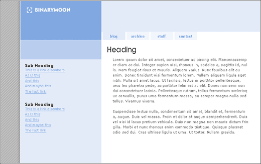
Version 2 & Version 3 – nice and blue
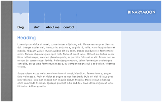
The blue made an appearance very quickly. Binary Moon has always been predominantly coloured blue and I wanted to keep the tradition with the new version. Version 3 shows the addition of some extra colour but it wasn’t working (at the time). Notice also the lefthand margin that has stayed in place for all of the versions 2.
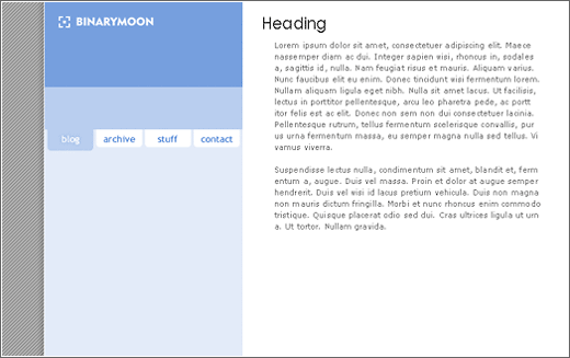
Version 4 – a good start
This was where the site started to feel right, not perfect – but a start.
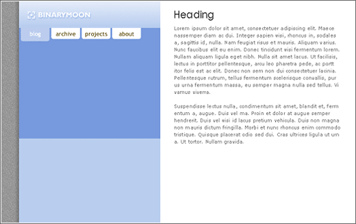
Version 5 – tabs… aarrggh!
Tabbed navigation – Not sure why I have become so obsessed with tabs but they crop up a lot on designs I work on. They rarely make it to the final site though.
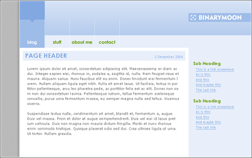
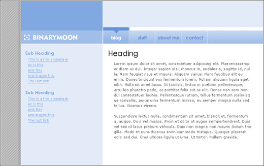
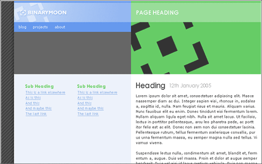
Version 6 & Version 7 – regression?
These two versions show the bit where I decided to seperate the navigation from the content. The seperation isn’t now as complete as it was going to be but essentially if you want to go somewhere you use the blue section. Yellow is the bit you should read. Notice how the change between v6 and v7 was basically ignored
Version 8 – that’s the one
Apart from a few changes in colour scheme, and a couple of extras Version 8 is the final site design.
Inspiration
My main sources of inspiration for the site were Box of Chocolates, and Subtraction although ideas were taken from all over.
Blogging Software
Now I had a design I was happy with I had to pick a blogging system to use. I downloaded all the major free blogging solutions (WordPress, Movable Type, and Text Pattern) and set about installing them on my home computer (using EasyPHP) to test things offline.
Movable Type required cgi so that was out straight away. I tried using perl a long time ago but didn’t have any success. I decided to stick to a purely php system so that, in the unlikely event I should want to , I can delve into the code and actually understand what’s going on.
Text Pattern – couldn’t get it to work on my personal computer. The databases wouldn’t setup properly and half an hour tinkering with it didn’t get me anywhere.
WordPress – installed very quickly. I easily beat the 5 minutes that WordPress claim the average user can be up and running in.
Next up was implementing my design as a template. I have never had a blog before so it was all new to me, but it only took an afternoon to get the first version of the Binary Moon blog going.
There are still a lot of things that need tweaking and a few features that I want to add (what could that grey box below the navigation be for?) but so far I am very happy with the design of the site.
How was it for you? Let me know on BlueSky or Mastodon
(Please) Link to this page
Thanks for reading. I'd really appreciate it if you'd link to this page if you mention it in your newsletter or on your blog.